For all our strengths, humans aren’t very good at bulk data processing.
Instead, thanks to the power of our optic nerves, we’re much better equipped for symmetry detection and spatial awareness. Data needs to be transformed into something we find visually meaningful before we can draw any actionable inferences. For mobile game developers in particular, this presents a unique challenge.
With an addressable audience of more than 2.4 billion people, mobile games deal with unparalleled volumes of player data. Thankfully, specialized frameworks have been developed to collect and store this information, but the sheer amount of data makes it uniquely challenging to derive actionable insights.
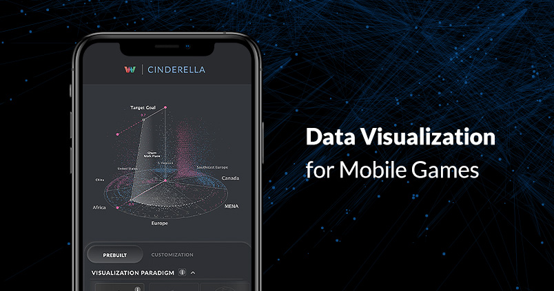
This is where data visualization comes in. Data visualization is the art of turning an ocean of raw data into rich, multidimensional visual paradigms. It all starts with knowing what information to measure.

The metrics that matter
With some estimating that 80 percent of data has a spatial component, the challenge is not lack of data, but arranging the scope and scale of data sets so that it clearly tells an instructive story. Left unchecked, data analysis can be made infinitely granular. Designers need to determine which key performance indicators will provide the most value when making decisions that can impact business outcomes. In the case of mobile games, these usually break down into three categories: engagement, retention, and monetization.
Engagement
Engagement metrics cover how players interact with gaming titles over time. This can include everything from the length of each player’s gaming session to the most common skills used in a role-playing game. They’re most valuable for designers looking to better understand their in-game economies, balance mechanics, and to improve player experience. While engagement metrics don’t always have a direct impact on business outcomes, they’re no less critical, and come in a variety of nuanced forms. Some commonly measured engagement metrics include:
Generic Engagement
Average number of sessions per day
Average number of sessions per user
Average session length
Average first-time session length
Engagement With Game Mechanics
Where players die most often in a competitive shooter
How often players win/lose a specific level in a puzzle game
Which upgrades players purchase in an adventure game
How far through a game’s tutorial players progress during their first session
Visualizing Engagement
High-level averages can be represented easily enough through simple numerical displays broken down by game version or user segment. Detailed game-specific data sets however, often require more sophisticated visualizations. Anything relating to location data, such as the distribution of defenses in a build & battle mobile strategy title, are often best visualized using heat maps. These are typically two-dimensional charts with localized areas that have been color-coded along a warm-to-cool spectrum in relation to player activity. Designers can utilize heat maps to better optimize user interfaces.

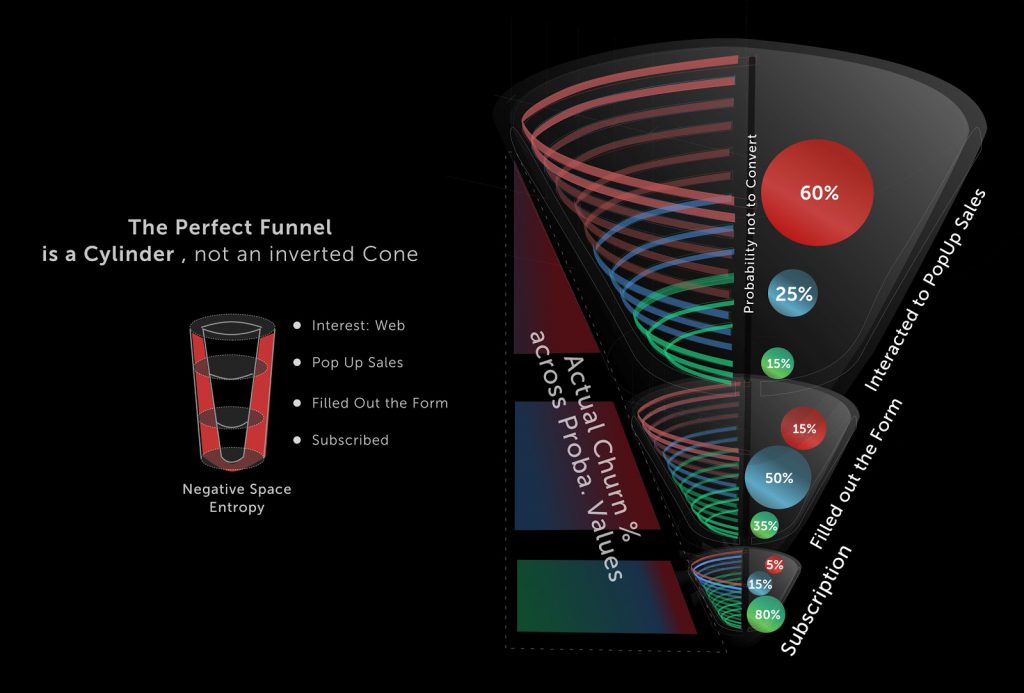
Funnels are another common engagement visualization tool that are especially useful for depicting aggregated player progression. This could be as granular as individual button taps in a game’s tutorial or the overall level completion progress in massive puzzle titles like Candy Crush. Much like marketing funnels, engagement funnels depict the volume of players that make it through a series of in-game steps. Funnels allow designers to identify points where attrition is highly likely and prioritize improvement opportunities such as adjusting difficulty or updating the interface at a specific stage of game progression. When players do quit, it’s what’s known as “churn”, which is a valuable metric in and of itself.
Retention
The cost of customer acquisition is typically five to seven times higher than customer retention, so the ability to track the frequency with which players are returning to a game pays dividends. From a publishing strategy perspective, retention is one of the most heavily scrutinized metrics, particularly as mobile games increasingly rely on ad impressions for revenue. By combining average session lengths, average number of ad impressions per session, and long-term retention figures, publishers can forecast revenue and justify development decisions with greater confidence.
Visualizing Retention
It’s standard industry practice to track 1 day, 7 day, and 30 day retention, though many top-tier publishers go several steps further. Retention is most often visualized using cohort tables, which are similar to heatmaps in that they use a range of relative color depths to illustrate retention among user segments. Darker colors indicate higher relative percentages.
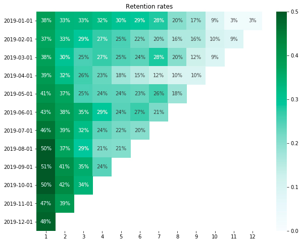
There are a variety of ways to calculate user retention. Some of the most common are classic retention, range retention, and rolling retention. Classic retention, also known as retention by day, shows the percentage of users that return to the game on specific days following their initial session. Range retention breaks down retention over defined time segments spanning multiple days making it ideal for tracking retention over extended time periods. Rolling retention, also known as return retention, illustrates a more immediate view of your current player base by showing how many players have started a session at least X number of days after their first session.
Monetization
Finally, monetization metrics are those most closely tied to revenue. They include everything from the percentage of users that made an in-app purchase (IAP) to the amount of ad revenue generated by cohort. Developers can harness monetization metrics to see detailed breakdowns of their generated revenue, make revenue forecasts, and plan their marketing budgets.
With so many titles crowding the app stores, gone are the days that developers could rely exclusively on organic discoverability. Some get lucky, managing to catch the eye of the Google or Apple editorial teams. Most, however, need a solid paid marketing plan in place. Keeping things net-positive requires an accurate estimate of how much revenue each new install is worth.
Many different metrics go into calculating a game’s overall monetization potential, including:
IAP conversion rate
Average revenue per user (ARPU)
Average revenue per paying user (ARPPU)
Average revenue per daily active user (ARPDAU)
Average interpurchase time
Visualizing Monetization
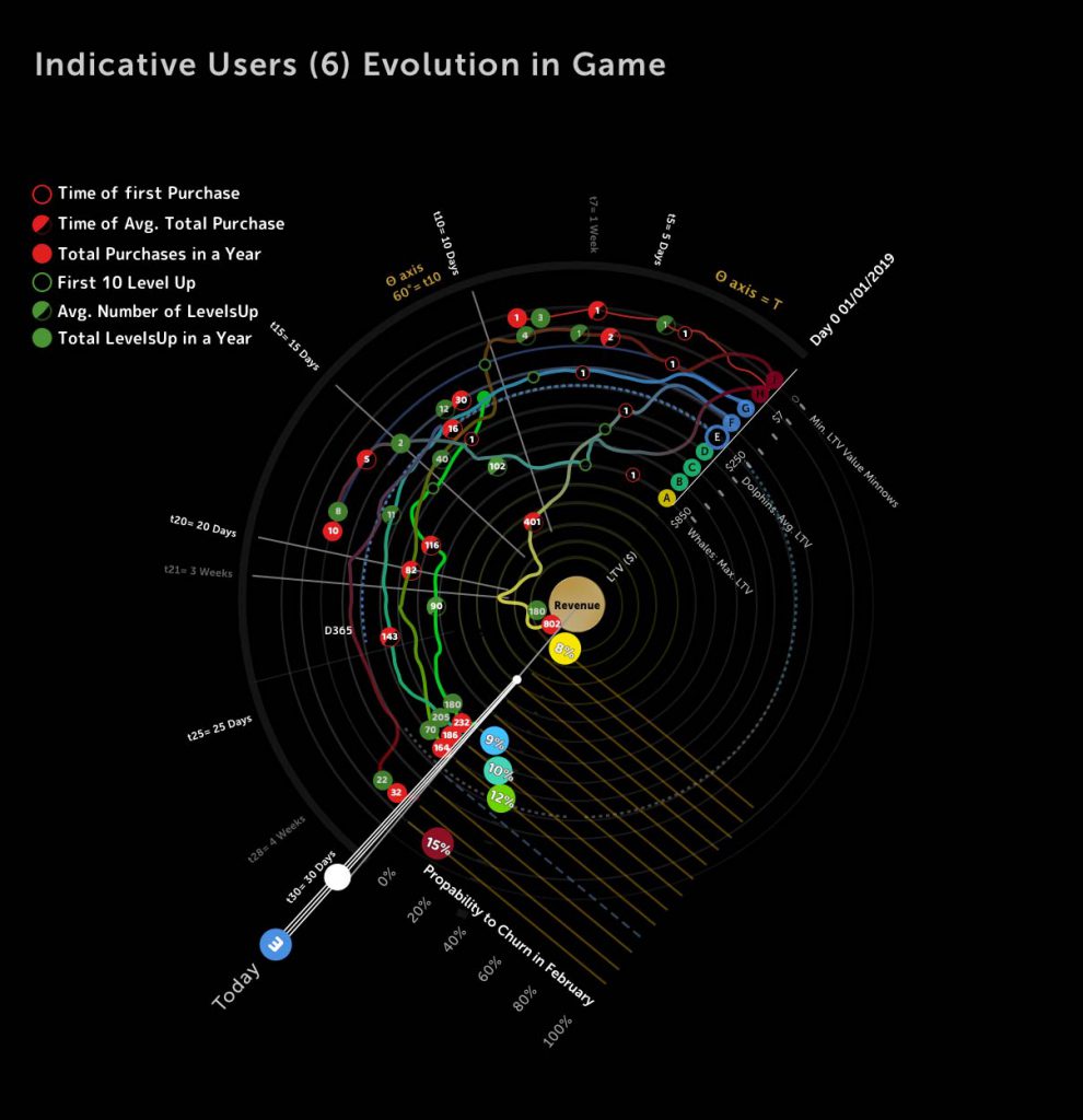
Most monetization metrics are either percentages of a game’s overall player base or a quantity of currency. Lifetime value, or LTV, is one of the most widely used. LTV aggregates both IAP and ad revenue to estimate the value of each user. Tracking LTV at a user level requires considerable operational overhead, but the benefits outweigh the burden. Subsequently, more publishers are pursuing ways to identify their most valuable users within the mobile ecosystem.
Like retention, monetization metrics require contextualization in order to realize their greatest value, and so are often broken out by cohort. Marketers often use mobile measurement platforms like Adjust or Tenjin to sort user cohorts by acquisition source and ad campaign. By analyzing monetization metrics across cohorts, marketers are quickly and easily able to understand which paid acquisition sources are producing the highest value. Armed with this data, they can balance their marketing budgets to maximize yield. Marketers can also visualize monetization metrics using interactive, multi-dimensional data visualizations to provide a comprehensive, holistic view of their user lifecycles.
https://www.gamasutra.com/blogs/AlexMoukas/20200325/360008/The_Beginners_Guide_To_Data_Visualization_for_Mobile_Games.phpWhile this article has explored some of the most common methods of data visualization, we’ve only just scratched the surface of what modern data science is capable of. Statisticians and engineers are always seeking new ways to represent complex data sets as insightful visualizations. Regardless of the approach, designers who leverage visualization tools will be significantly more effective when it comes to maximizing engagement, retention, and revenue than those who do not.
See Alex’s original article on Gamasutra